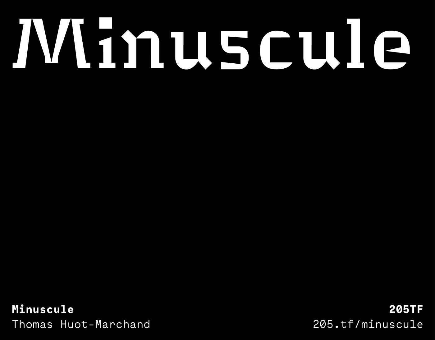
Miniscule is a typeface designed for very small sizes. Its creation was inspired by the theories of ophthalmologist Emile Javal and his “theory of compact prints” (Physiologie de la lecture et de l’écriture /Physiology of reading and writing, Paris, Alcan, 1905). Thomas Huot-Marchand initiated this project at the Atelier national de recherche typographique in 2001-2002, and completed it, designing the italics in 2006–2007 during a residency in the Académie de France in Rome – Villa Médicis.
The font comes in five versions, all optimised for 6, 5, 4, 3 and 2 points. The design evolves progressively as "the size decreases": the spacing and the "x-height" increase, the contrast decreases, "inktraps appear" and the design is simplified. The MinUscule 2 is the strangest: “at this size, said Javal, we pay more particular attention to the difference between the letters”. As a consequence, the particularities of each sign are exaggerated, and the secondary details eliminated.
The contrast of the italics is not found in the spacing, almost identical to the roman, but by a more rhythmic design, progressively more lively and broken.
The Minuscule has received a number of awards: from the Type Collectors Club in New York in 2005 (Certificate of excellence in type design); Erik Spiekermann declared it to be the Favourite Font of 2007 in Typographica (http://typographica.org/typeface-reviews/minuscule/ ), and Paul Shaw described it as one of the typefaces of the decade in Print magazine (http://www.printmag.com/imprint/ten-typefaces-of-the-decade/ ). In 2016, a group of more than 256 original drawings of the Minuscule were acquired by the Centre national des arts plastiques.
“A historically inspired face that is stranger than either ITC Bodoni or ITC Founder’s Caslon is Minuscule (2005), a typeface designed by Thomas Huot-Marchand to test the ‘theory of compact printings’ pronounced by Louis-Emile Javal, a nineteenth-century French ophthalmologist. The font comes in five versions, all optimised for small sizes: Minuscule Six (6 pt), Minuscule Cinq (5 pt), Minuscule Quatre (4 pt), Minuscule Trois (3 pt), and – a true micro-font – Minuscule Deux (2 pt). This last item is as bizarre as anything created during the heyday of grunge type back in the 1990’s.”
Paul Shaw, Scale and spirit (size-specific fonts) in Eye 71 Vol.18, spring 2009
With the efficient and precious help of Roxane Gataud.

